Common Accessibility Issues and Quick Fixes
Common Accessibility Issues
Welcome!
This quick‑reference page is designed to help you navigate the most common accessibility issues we see digital files. Each topic below includes a “+” icon you can click to expand, giving you simple explanations and fast, practical fixes you can apply right away. Think of this as your go‑to toolkit—easy to skim, easy to use, and perfect for those moments when something “just doesn’t look right.” Whether you’re updating a document, creating new content, or troubleshooting Ally feedback, these bite‑sized guides will help you make materials more accessible for everyone with confidence and ease.

Top 12 Common Accessibility Mistakes and Quick Fixes
Missing Alt Text on Images
• Screen readers cannot interpret visuals without alt text.
To add alt text in Office programs:
Right click on an image and select View Alt Text.
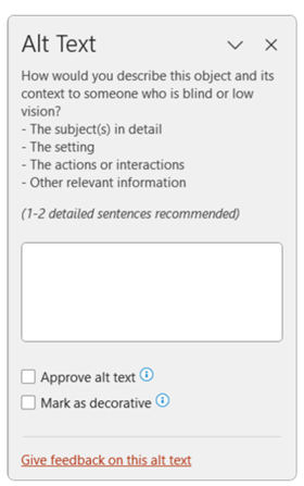
Enter a description in the dialogue box.
If a graphic is purely decorative, check Mark as Decorative.
To add alt text in Office online programs:
Select the image
Navigate to the Picture tab
Select Alt Text and enter your description in the Description field.
If the image is purely decorative, leave the Description field blank.
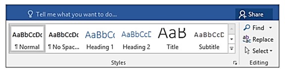
Using Visual Formatting Instead of Headings
Why it matters:
Screen Reader Navigation: Screen readers rely on programmatic headings to let users jump between sections. Visually formatted text (bold, larger font) is read as normal text, forcing users to listen line by line.
Loss of Structural Hierarchy: Heading styles communicate the structure and relationships between sections. Without them, assistive technologies can’t tell what content is primary or subordinate.
Navigation Pane and Table of Contents: Built-in navigation tools only recognize true heading styles. Visually formatted headings won’t appear, making documents harder for everyone to navigate.
Use Home > Styles to apply built-in heading styles.
Maintain a logical heading structure (H1, H2, H3).
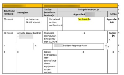
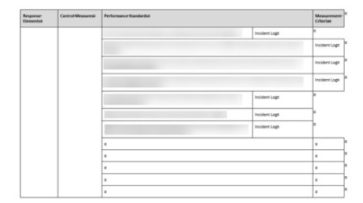
Tables Used for Layout (Not Data)
• Tables should be used only for data, not for layout or visual formatting.
Using tables to position text or images creates several accessibility issues:
Screen readers lose their place when a table includes merged/split cells or nested tables. They track position by counting cells, and non‑data tables break that logic.
Blank rows or columns may cause a screen reader to think the table is over or that content is missing.
Tables used for spacing make documents confusing to navigate because assistive technologies read the “fake structure” as real content.
Beginners often create layout tables because they look good — but accessibility tools cannot interpret them correctly.
How to Recognize a Layout Table
A table might be a layout table (and not a real data table) if:
✔ It is used just to position text or images side‑by‑side
✔ It contains many empty cells
✔ It has merged cells for “design”
✔ It has no logical header row
✔ The content wouldn’t make sense if read cell‑by‑cell
If any of these are true, the table is not accessible.
Avoid merged/split cells and remove blank rows/columns.
Use a Header Row for data tables.
To add a header row to a table
Choose Insert > Table to insert a table.
Choose the number of boxes you want across to create columns, and then choose the number of boxes you want down to create rows for your table.
Note: When you add a table to your document, two new tabs to appear in the ribbon: Design and Layout. These are the Table Tools.
On the Design tab, choose the Table Styles Options group, and then choose Header row. Other options include Banded Rows or Total Row.
Low Color Contrast
Low contrast makes text hard to read.
Use dark text on a light background.
Avoid using color alone to convey meaning.
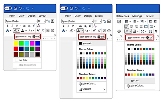
To resolve a Hard-to-read text contrast issue (Microsoft products):
The tools needed to address hard-to-read text contrast issues are located on the Home tab.
Select the font.
Change the Font Color, the Highlight Color, or the Shading Color.
Each of those tools offers a range of colors including custom colors for Font Color and Shading. However, the most useful feature is the High-contrast only toggle present on each menu.
Non-Descriptive Hyperlinks
Links like 'Click here' do not inform users about their destination.
Use descriptive link text (e.g., 'Download the syllabus').
Method 1: Using the Right-Click Menu (Fastest)
Type and Highlight: Type the descriptive text (e.g., Read the Q3 Report) and highlight it with your mouse.
Open Hyperlink Menu: Right-click the highlighted text and select Link or Hyperlink from the context menu.
Insert Address: In the dialog box, paste the URL into the Address field at the bottom.
Confirm: Click OK.
Method 2: Using the Insert Menu (Ribbon)
Select Text: Highlight the text you want to make a link.
Go to Insert: Click the Insert tab in the top ribbon.
Select Link: Click on Link (or Hyperlink) in the "Links" group.
Add URL: Paste the web address into the address bar and click OK.
Improper Spacing (Using Multiple Enters)
Multiple blank lines disrupt assistive technology.
Use Line and Paragraph Spacing instead of manual spacing.
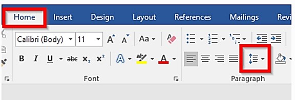
Spacing options on the Word Ribbon
Formatting and Styles to Avoid
The following formatting and object types are not communicated to assistive technology or present significant barriers to some users and should be avoided:
Strikethrough
Highlighting
Drop cap
Word Art, Smart Art, text effects
Ungrouped related shapes
Watermarks
Symbols, except for the following safe characters:
@ (the at symbol)
& (ampersand)
/ (slash)
© (copyright)
® (registered)
™ (trademark)
¶ (paragraph)
• (bullet)
$ (dollar)
€ (Euro)
£ (British pound)
¥ (Yen)
% (percent)
½ (one half)
¼ (one fourth)
¾ (three fourths)
° (degrees)
Lists Not Formatted as Lists
Use the list tools to create lists. Creating lists using asterisks or dashes will not inform assistive technology that the content is part of a list. Lists are useful for steps in a process or grouping items. It is important that everyone is made aware of the presence of a list.
Use bullet lists for unorganized lists
Lists where the sequence is not important
Use numbered lists for items where sequence is important
Such as steps in a process
To create a list in Word
On the Home tab.
Select Bullets, Numbering, or Multilevel List.
Common Accessibility Error: Reading Order Out of Sync (PowerPoint)
What’s happening:
Slide content is added or moved visually, but the reading order for screen readers does not match what appears on the screen.
Why this is a problem:
Screen readers read slide content in a specific order that may differ from the visual layout. If the order is incorrect, users who rely on assistive technology may hear information out of sequence or miss key points.
How to Fix
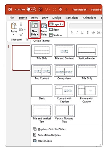
Use placeholders:
On the Home tab select New Slide Button.
Choose desired layout.
Change an existing slide by selecting Layout on the Home tab.
Work in order to add content to the slide:
Enter a title in the title placeholder.
Add content to first placeholder.
Add content to second placeholder, etc.
Use built-in tools to add slide numbers or footers.
Avoid manually inserting textboxes.
For more information, watch this video on creating accessible reading order.
Ignoring the Accessibility Checker (Don't do it)
• Accessibility Checker identifies issues like missing alt text or table errors.
• Go to Review > Check Accessibility and follow prompts.
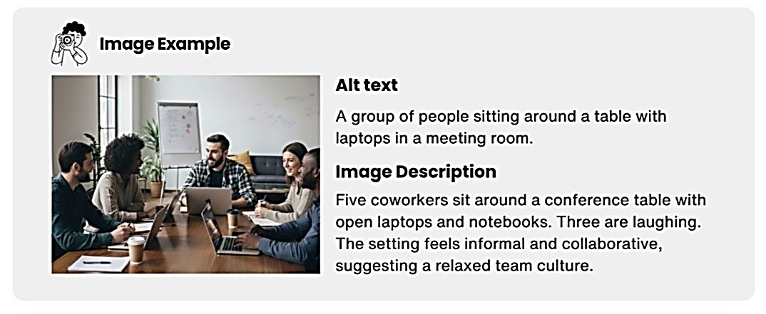
Alt Text and Image descriptions
They are not the same thing.
| Criteria | ALT Text | Image Description |
|---|---|---|
Who is it for? | Screen Reader Users | Everyone |
Where it lives on the file/document? | In the code( not visible) | Visible content( caption, body copy or expandable detail) |
Purpose | Convey the essential meaning of an image | Add depth, context, storytelling |
Length | 100-125 characters( depending on the software) | Flexible |
Example:
Missing or Incorrect File Names & Document Titles
(A very common accessibility mistake — and Microsoft specifically highlights it.)
Why It’s a Problem
Microsoft emphasizes that descriptive file names and document titles are essential for accessibility. Screen readers announce file names, so unclear or generic names (e.g., Document1.docx, Syllabus_Final_Final2.docx) make it difficult for users to understand what they’re opening.
Quick Fix
For the file name:
Go to File → Save As
Enter a descriptive name
Example: BIO120_LabSafety_Guide.docx instead of Lecture.docx
For the document title (different from the file name):
Go to File → Info
Under Properties, enter a meaningful Title
Example: Biology 120 Lab Safety Guide
Why This Helps
Screen reader users hear the file name first when navigating
Helps everyone quickly identify the purpose of a file
Reduces confusion in shared courses, LMS modules, and email attachments
Titles carry over into tagged PDFs, improving accessibility downstream.